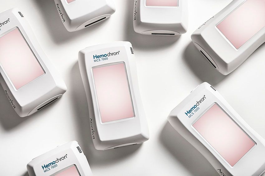
I was experimenting with an image I captured during a product shoot for Accriva Diagnostics. Their product, although wonderfully designed and having beautiful flowing curves, did not contain much color so I needed to use another design element to liven up the shot. Sometimes I will go for a textured or colorful background, but in this case I tried to add some attitude to the photography by creating an interesting grouping with some visual impact. When I originally shot the product the screens were not on as their marketing department was going to drop in a screen image later. I took the opportunity to introduce just a little bit of color to juice up the image a bit. Since this product tests blood I first tried a very saturated red, but rejected it as being overwhelming and over the top. Staying in the same family of colors I ended up using a pastel color that I felt worked well. I hope you agree.

Experimenting with a product shot.
